Main Dashboard
This article explains how to navigate and interpret the Encompass Main Dashboard, which provides a live map and key data on Drivers and Vehicles. The top-of-page Driver and Vehicle tabs display counts for various statuses, and clicking each metric links directly to the relevant section of Encompass. The live map includes Zoom, Drag, Legend, Map Style, Refresh, and pop-out features to track Drivers and Vehicles in real time. Below the map, charts display data such as Expired Qualification Items, Hours Available, DVIR Defects, and Preventive Maintenance Due, with clickable titles for quick navigation. These tools allow users to monitor fleet status and address issues efficiently.
Reading the Top-of-Page Data
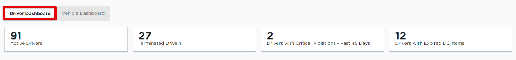
The Driver and Vehicle tabs near the top of the page show data for related information pertaining to that area of Encompass.
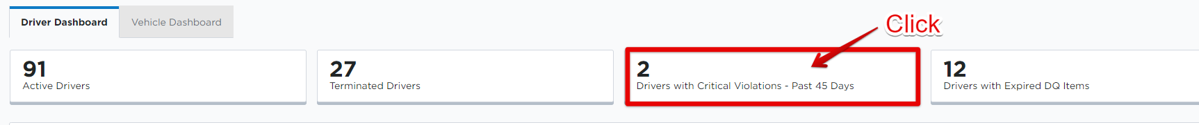
- The Driver Dashboard shows counts for: Active Drivers, Terminated Drivers, Drivers with Critical Violations, and Drivers with Expired DQ Items.
- The Vehicle Dashboard shows counts for: Active Vehicles, Vehicles Not Plated, Dosposed Vehicles, and Vehicles Out of Service.

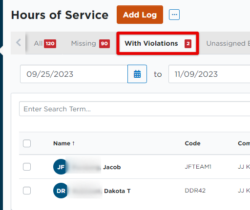
Clicking on the individual buttons will take you to that specific area within Encompass. For example, clicking on Drivers with Critical Violations will take you directly to the Hours of Service > Violations area.
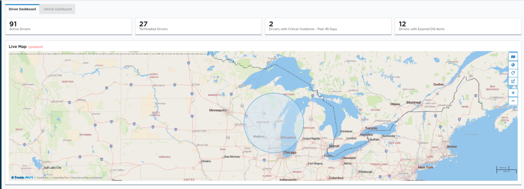
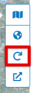
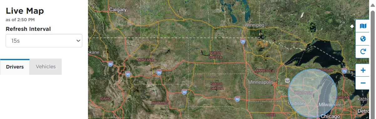
Reading the Map
Use the +/- buttons to zoom in and out on the map in order to more specifically locate your drivers/vehicles. You can also use your mouse/touchpad to click and drag around the map and zoom to specific locations, etc.

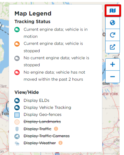
Click on the Map icon located on the right side of the map to open up the Legend. This legend shows definitions of what the various markers mean. Additionally, you have the ability to View/Hide additional items on the map. Clicking the item will cross it out to hide it from your map view. Clicking again will allow the item to display in the map.
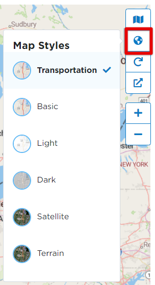
The Globe icon will give you various options of map styles.
The Refresh button will refresh the statuses/locations of your drivers/vehicles.
The arrow icon will open the map in a pop-out window where you can view driver/vehicle information, and choose a time interval to automatically refresh the pop-out map.
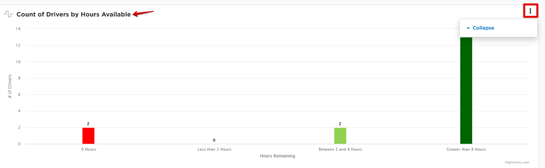
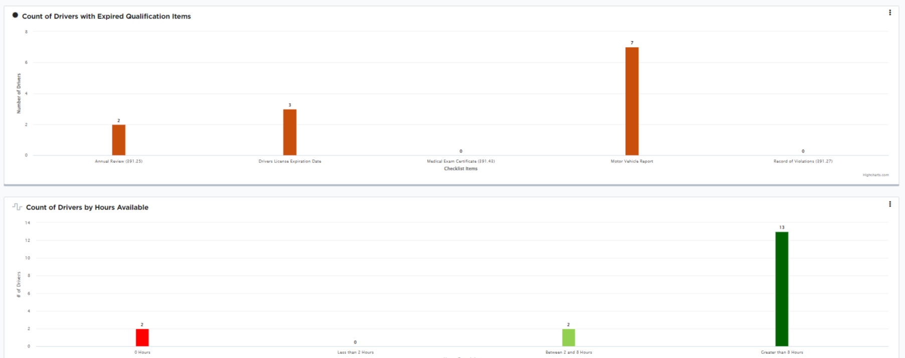
Reading the Charts
On the Driver Dashboard, the charts show data for: Count of Drivers with Expired Qualification Items, Count of Drivers by Hours Available, and Count of Drivers with Critical Violations - Past 45 Days.
On the Vehicle Dashboard, the charts show data for: Count of Units with Expired Renewable Items, Count of DVIR Defects, and Vehicles - Preventive Maintenance Due
- Clicking on the title of the chart will take you to that specific area in Encompass.
- The three dots on the right will open/close the chart on the dashboard.
- The numbers on the left side of the chart (y-axis) display the number of drivers/units. The items on the bottom (x-axis) show the specific type of data. For example, below you can see that 1 driver has between 2 and 8 hours available.