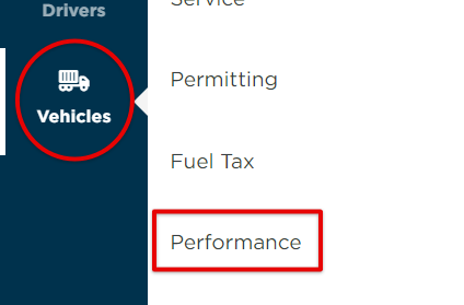
Viewing Unit Performance
Go to Vehicles > Performance.
The tabs across the top will provide different lists of Unit Performance based on your selection. (ie. selecting the Over Speed tab will show all units that were over speed within the specific date range.)
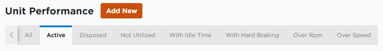
Find the desired unit by using the tabs across the top, searching for a specific unit, using the Advanced Filters, or by selecting the unit from the list upon arrival to the Unit Performance section. Click on the unit to view its performance data.

Unit Performance
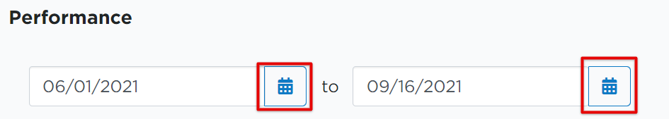
The data shown on this screen occurs within the date range shown at the top of the driver's Performance page. Adjust these dates to see a specific range of data, if desired, by clicking the calendar icons next to each date field.
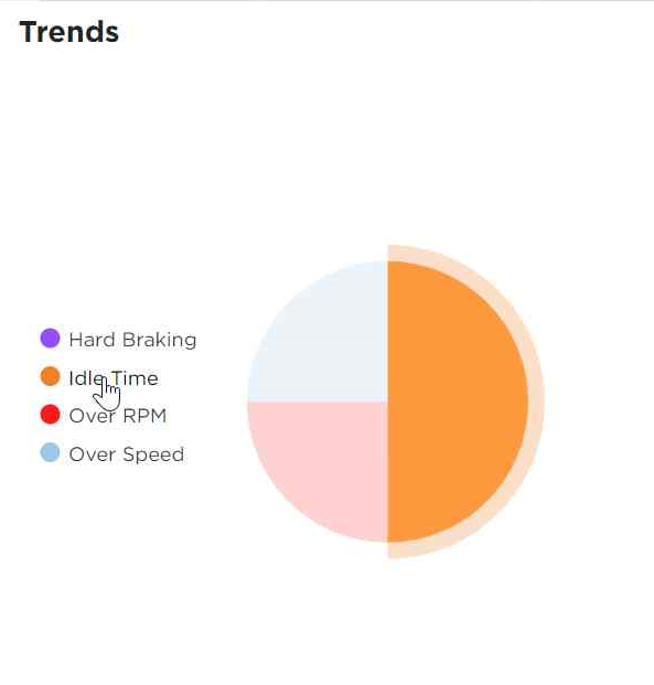
Trends
The Trends section shows unit/vehicle performance data for the selected date range.
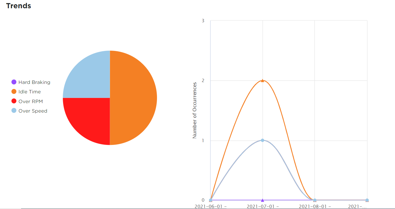
Circle Chart
The data is color coordinated between the name of the event/status on the left and the circle chart results on the right. (ie. Idle Time is orange in color). Hover over each "event" to reveal a highlighted view of that specific dataset in the circle chart.
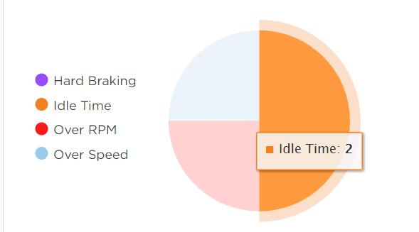
Hover over the pieces of the circle chart to reveal the number of occurrences of that event.
Click on one or multiple data titles to remove those results from the circle chart and the line graph. The selected event will be grayed out. In the example below, "Over Speed" has been removed from the circle chart and line graph view.
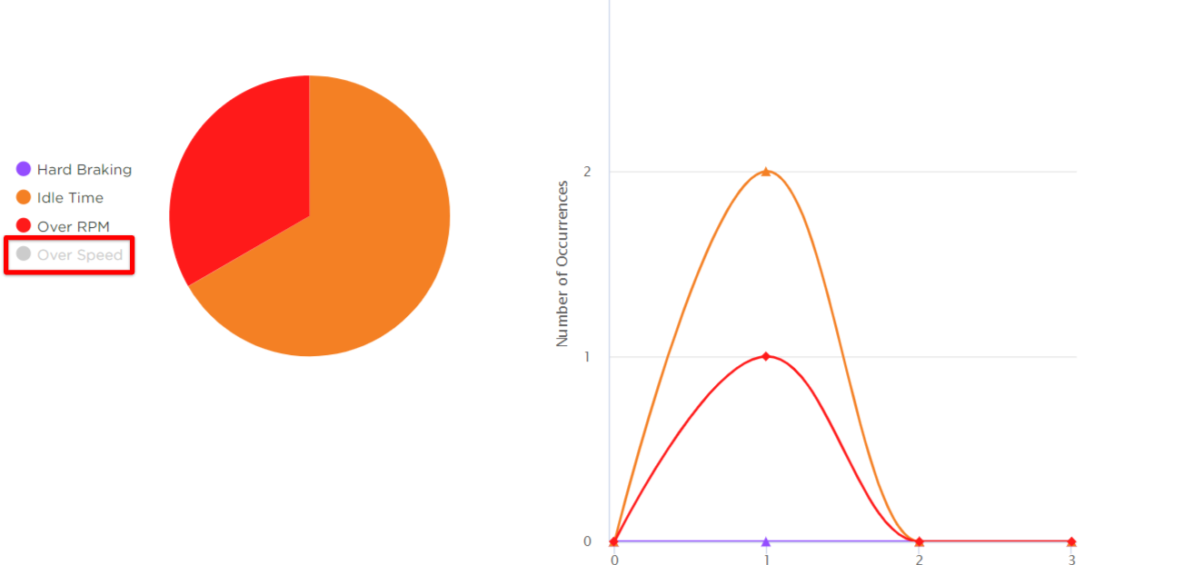
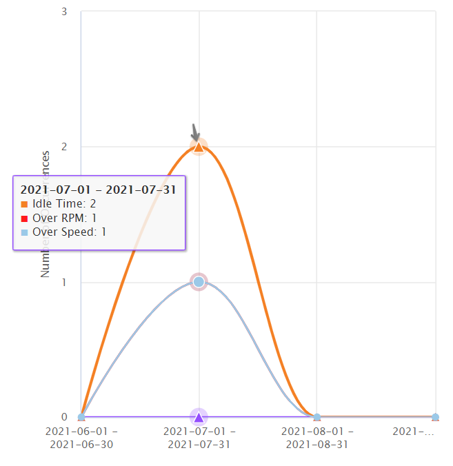
Line Graph
The line graph displays the various data in "Number of Occurrences" on the y-axis and the date range/s on the x-axis.
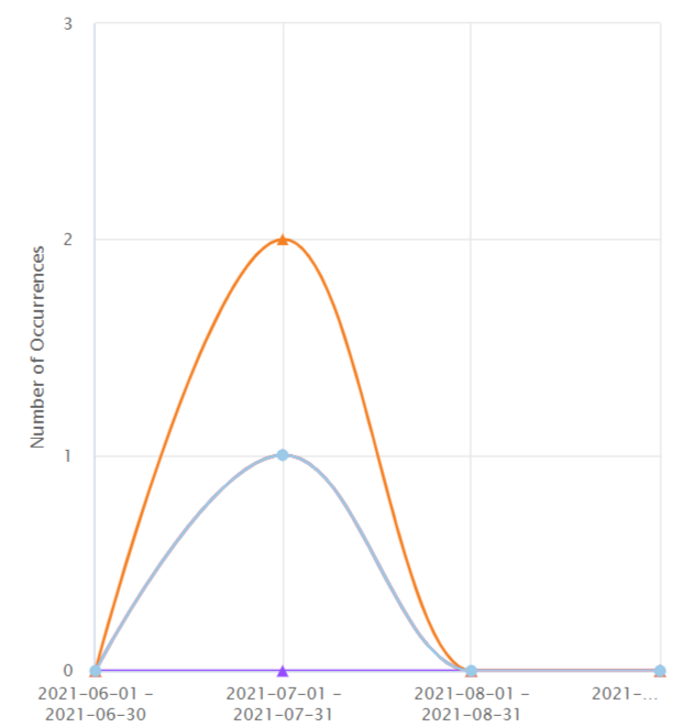
Hover over a specific point of the line/s to reveal the number of occurrences for that point's specific date range.
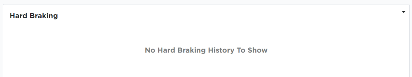
Hard Braking
The next section lists any Hard Braking events for the unit/vehicle within the date range selected. If there was no hard braking for the specified date range, the section will be noted as such:
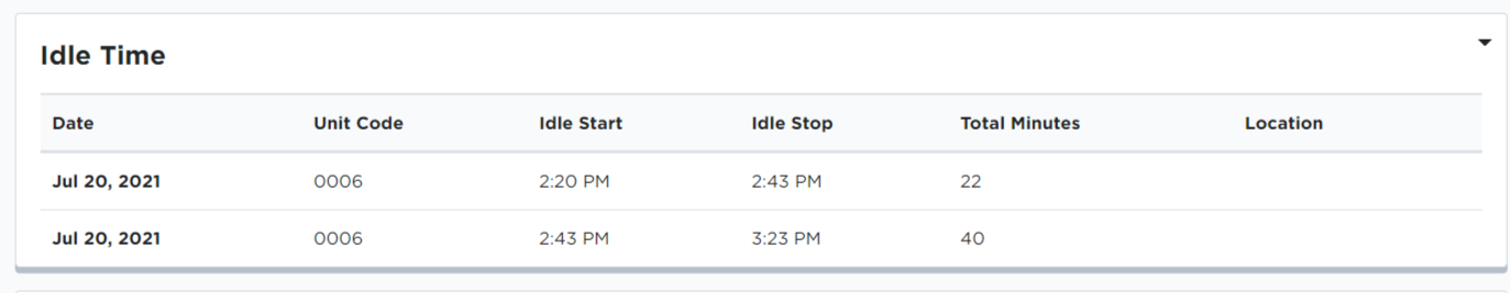
Idle Time
Idle Time will show any period greater than 5 minutes in which the unit/vehicle is running, but not moving.
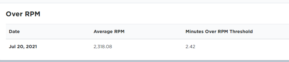
Over RPM
The Over RPM section shows the average RPM for each day the unit/vehicle moved within the date range and any minutes spent over the threshold. (The threshold for your units/vehicles is set in your company settings.)
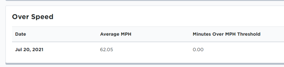
Over Speed
The Over Speed section shows the average MPH for each day the unit/vehicle moved within the date range. Additionally, any minutes spent over the threshold that was set up in your company settings will be reported.
MPG
The MPG section shows the average MPG for each day the vehicle moved within the specified date range.
The ELD calculates the miles via the ECM port in the vehicle. Once those miles are submitted to Encompass, the fuel that is entered manually into the app or Encompass is then broken down by those miles.
